Z Space
Rebrand
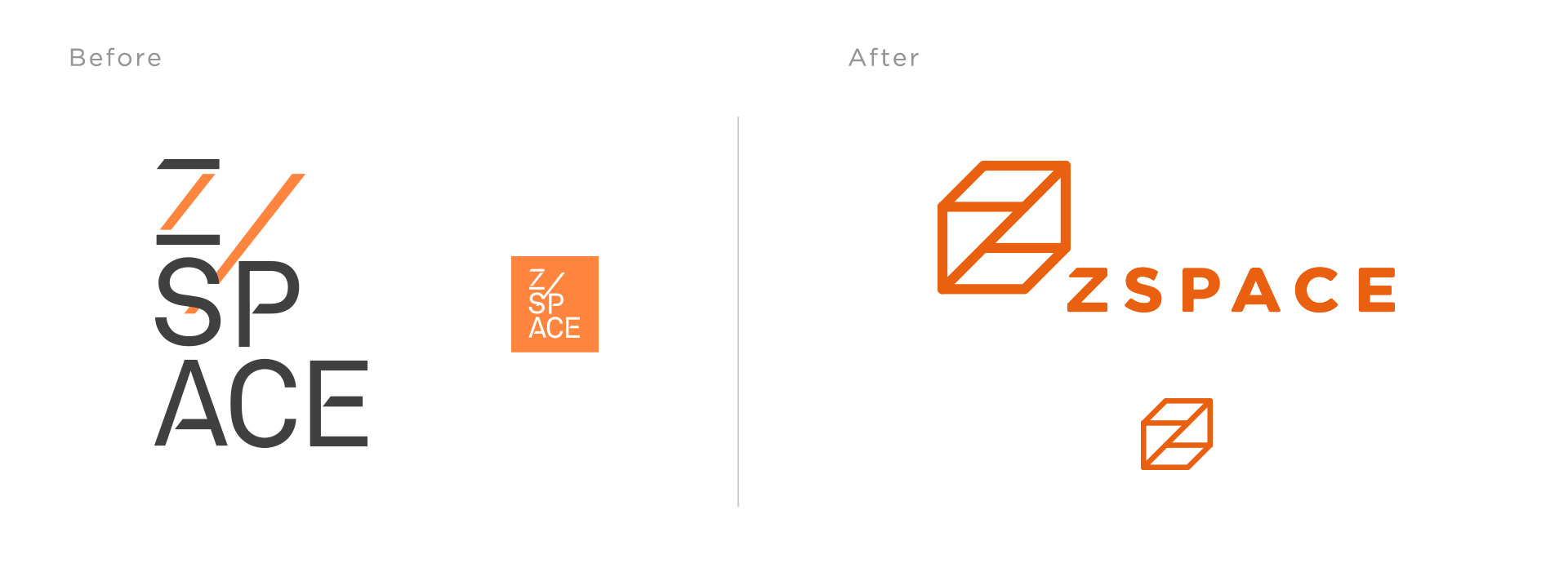
Based on the concept of dimensions and the Z-axis. Using just lines, it is stripped back and represented in its purest form.
What it looks like is if a Necker cube had the Z- axis connected and with two edges removed, creating an impossible object. Its ambiguity creates a sense of wonder, creativity and playfulness.
The idea accentuates when the word mark is in motion, where a flat 2D line grows into a 3-dimensional geometry resolving into a wireframe cube to a moment letter “Z” formed in front of your eyes.


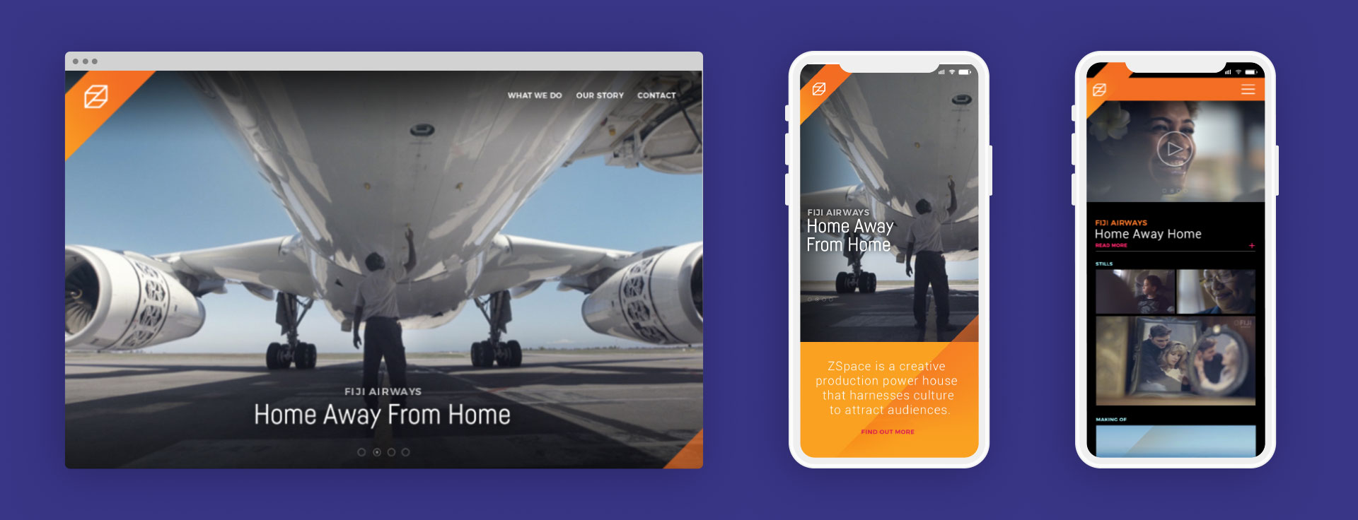
UX/UI Design


